A11Y Level up! (Leveling Up Web Accessibility)
Web accessibility for everyone! Let's look at what web accessibility is and which guidelines apply.
Before we begin, do you know what the A11Y in the title means?
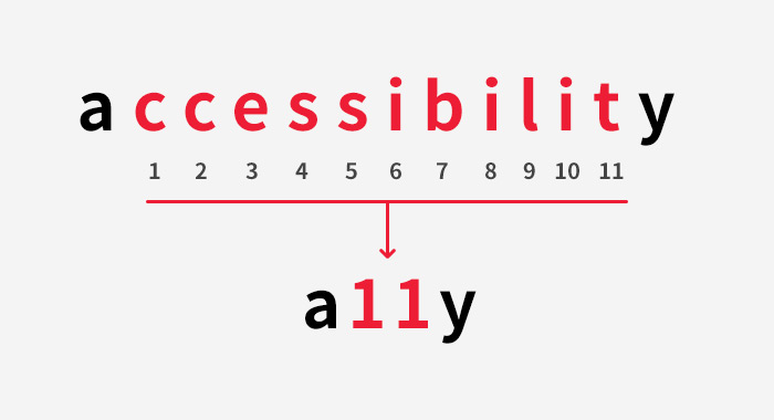
It is an abbreviation of the English word “accessibility.” The number 11 stands for the number of letters omitted between the first and last letters of the word. Good to know, right?
What is web accessibility?

Tim Berners-Lee, the inventor of the web, defined the web as “a space where everyone can easily share information, regardless of disability.” Because he emphasized accessibility as part of the web’s core philosophy, it is always a good idea to consider web accessibility when building a website.
What matters here is that web accessibility is not only for people with disabilities.


In everyday life, you can see accessibility features such as tactile paving, low-floor buses, and ramps.
A ramp next to stairs was originally built for people with disabilities, but everyone can use it, including people pushing heavy loads on a cart or parents pushing strollers.
The web is the same. Accessibility guidelines include the rule that “all functions provided by web content must be operable with a keyboard alone.” This helps not only people with disabilities who find a mouse hard to use, but anyone whose mouse suddenly breaks or who doesn’t have one. In this sense, web accessibility means making things work well for anyone, at any time, in any situation.
Web accessibility guidelines
The Korean Web Content Accessibility Guidelines consist of 4 principles, perceivable, operable, understandable, and robust, along with 13 guidelines for following those principles and 24 checkpoints for verifying compliance. Let’s look at a few of them.
Alternative text
– Non-text content must have alternative text so that its meaning or purpose can be perceived.
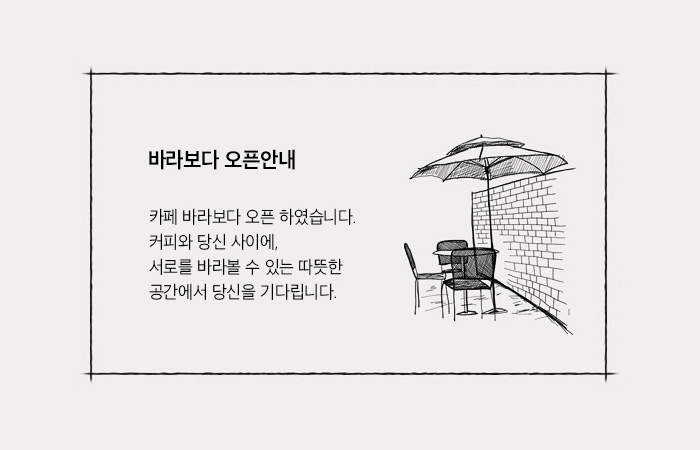
<img src="..." alt="Baraboda opening notice - Cafe Baraboda is now open. Between coffee and you, we await you in a warm space where we can look at each other.">
Alternative text (alt=”…”) must contain the same information as the image, so that blind users who cannot see images, or anyone whose images fail to load because of their system environment, can still perceive the information.
- For content where the meaning of a background image must reach the user, provide alternative text so that its meaning is conveyed through assistive technology.
Content whose meaning is carried by a background image cannot take an alt value, so provide alternative text through hidden content.
<nav class="sns_menu">

<a class="facebook" href="link" target="_blank" rel="noopener noreferrer"><span class="sr_only">Facebook</span></a>

<a class="youtube" href="link" target="_blank" rel="noopener noreferrer"><span class="sr_only">Youtube</span></a>

<a class="instagram" href="link" target="_blank" rel="noopener noreferrer"><span class="sr_only">Instagram</span></a>

</nav>
.sr_only {position: absolute;height: 1px;width: 1px;overflow: hidden;clip: rect(1px 1px 1px 1px);clip: rect(1px, 1px, 1px, 1px);}
With this markup, the text is not visible on screen but remains accessible to screen readers.
- (BUT) You don’t need alternative text when it would only add unnecessary description
For content used purely for decoration or visual form rather than to convey information, hearing a description through assistive technology can actually cause confusion, so provide an empty string as the alternative text.
<img src="image-url" alt="">
Providing empty alternative text (alt=””) skips meaningless information, so the content can be understood more quickly and clearly.
Alternatives for multimedia
To make multimedia content perceivable by people with disabilities on an equal basis with others, you must provide captions, transcripts, or sign language. The most important point is to provide content equivalent to the multimedia content. The best approach is to provide closed captions synchronized with the audio. For video without dialogue, provide audio description (text, audio, or a script). For audio-only content, you must also provide captions, a transcript, or sign language. Captions, transcripts, and sign language must be equivalent to the context of the speech in the multimedia content.
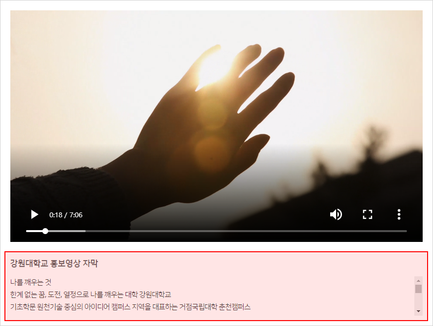
Source: Kangwon National University http://www.kangwon.ac.kr/www/contents.do?key=105&
Clarity
– Content must be perceivable regardless of color.
All information provided in content must be perceivable by users who cannot distinguish certain colors, users of monochrome displays, users viewing black-and-white printouts, and users in high-contrast mode.
Rather than distinguishing or conveying information by color alone, express each piece of information through color, shape, and pattern so that everyone can perceive it, including users who cannot distinguish certain colors and users of monochrome displays.
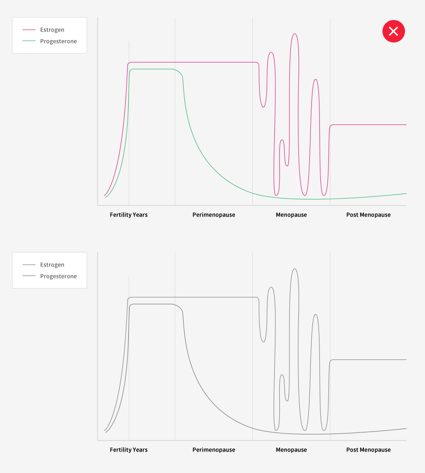
When converted to black and white, content distinguished only by color is hard to tell apart.
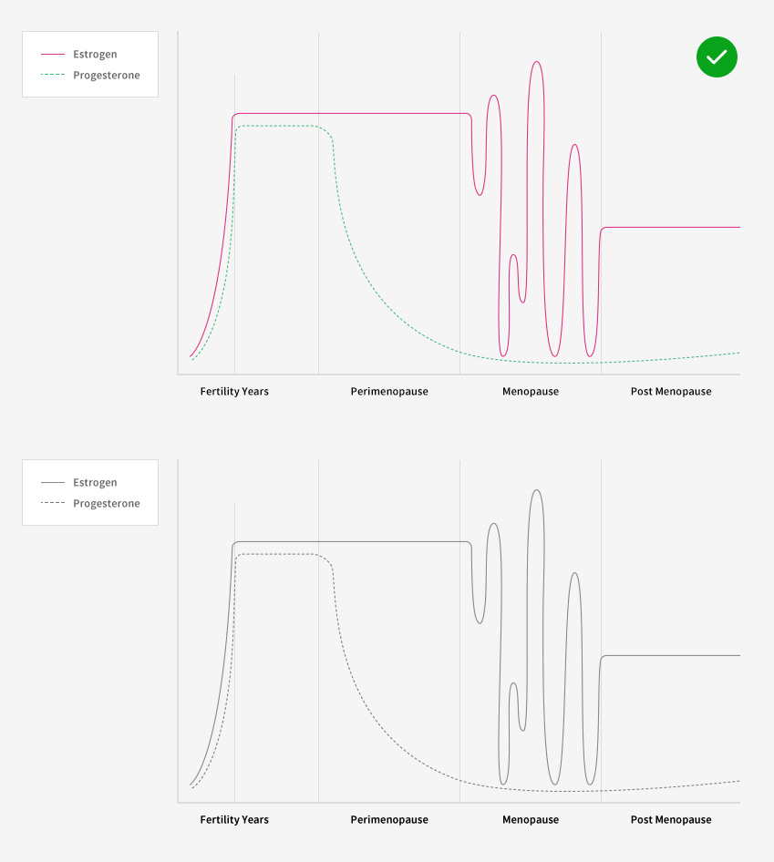
Content distinguished by patterns and shapes can be told apart even without color.
– Instructions must be perceivable regardless of shape, size, position, direction, color, or sound.
This checkpoint applies only to content that points to specific elements or gives instructions. It means instructions needed to use the content must not rely on a single sense, such as sight or hearing. In other words, content must be provided so that instructions can be perceived through other senses as well.
For example, instead of “Please click the button below,” it is better to give a clear instruction such as “Please click the OK button.”
– The contrast ratio between text content and its background must be at least 4.5 to 1.
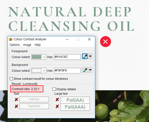
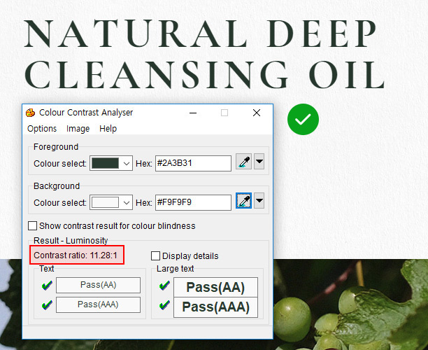
The contrast between text and background color, and between text in images and background color, must be at least 4.5 to 1 so that people with low vision, older adults, and others can perceive the content.
- When a contrast ratio of 3:1 is allowed
– When text is 18pt or larger, or 14pt or larger in bold
– For regular text or text in images on pages that can be zoomed (since browsers provide basic zoom, you can assume 3:1 may be acceptable in practice. Still, the higher the contrast, the clearer the distinction, right?) - Exceptions to the contrast requirement
– Logos, decorative content, and content whose contrast increases when it receives focus via mouse or keyboard are not included in the contrast checkpoint.
Input device accessibility
– All functions must be usable with a keyboard alone.
– Keyboard focus must move logically and be visually distinguishable.
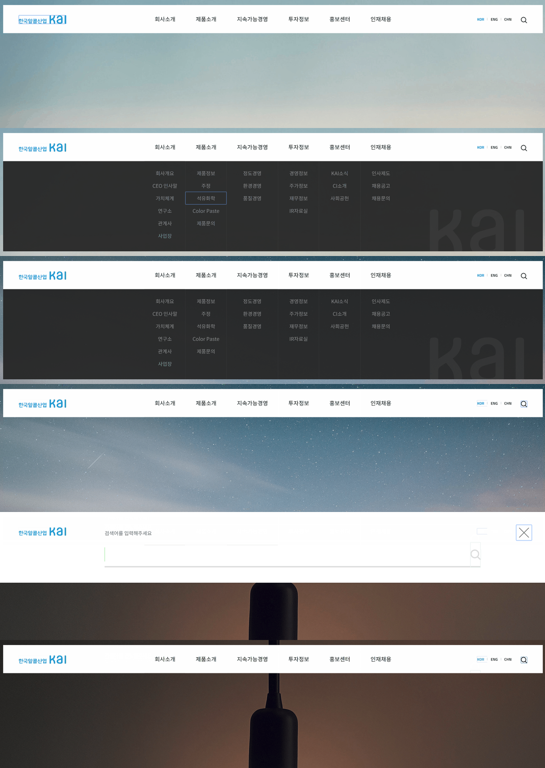
When using a keyboard, focus must move & be visible to the eye, and every function available with a mouse must work the same way with a keyboard alone.
Providing enough time
– Users must be able to control content that changes automatically
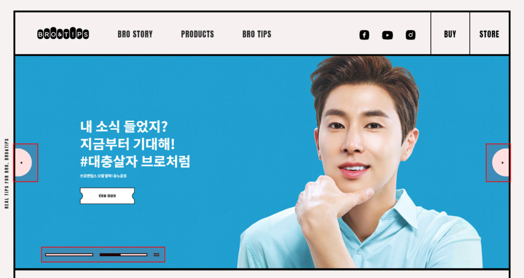
People who read slowly or have difficulty using a mouse may struggle to get information when content changes automatically, so provide previous, next, pause, and play buttons as controls to give enough time to read and use the content.
(Explicit buttons are best, but if there are only previous/next buttons and not all controls such as play and pause, it is reportedly considered compliant if the motion stops when the mouse hovers over or the keyboard focuses on the content area.)
Preventing photosensitive seizures
– Do not provide content that blinks or flashes 3 to 50 times per second.
Do not provide blinking or flashing screens, and if you must, warn users in advance.
A related incident occurred in 1997, when children watching Pokémon had seizures. It was caused by a scene in which blue and red flashed alternately, and the show had to be temporarily taken off the air.
Like this, content that blinks or flashes can trigger seizures in certain users, so be careful.
Warning: the video below includes the problematic scene from the actual broadcast that caused photosensitive seizures.
https://youtu.be/q4dDaxHtQDU
Source: https://namu.wiki/w/%ED%8F%AC%EC%BC%93%EB%AA%AC%20%EC%87%BC%ED%81%AC
Input assistance
– Provide a way to correct input errors.
When an error occurs in an online form, tell the user where the error occurred and why. For example, if a form asks for name, address, phone number, and email address and the user submits it with some fields empty, tell them which fields are missing.
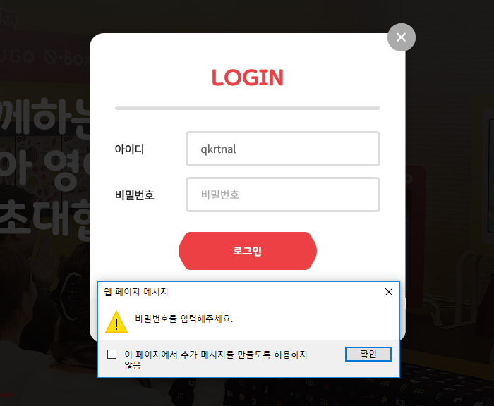
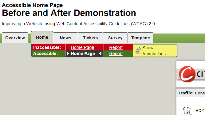
Comparing accessible and inaccessible sites
https://www.w3.org/WAI/demos/bad/after/home.html
On this site you can compare web accessibility demo sites (the demo can be downloaded).
Inaccessible is the site before accessibility was applied, and Accessible is the site after.
At a glance they look the same, but you can see many differences when users actually use the sites.
Wrapping up
That covers the basics of web accessibility. The guidelines contain many more checkpoints, and this post covers only some of them; to see the full list, please refer to the accessibility guidelines provided by the Web Accessibility Research Institute.
Download the Korean Web Content Accessibility Guidelines 2.1 (PDF, Korean)
Let’s keep caring about better web accessibility and work together so that everyone can use websites in a better environment 🙂
May.2019By Studio JT