HAUTERRE
Visit Site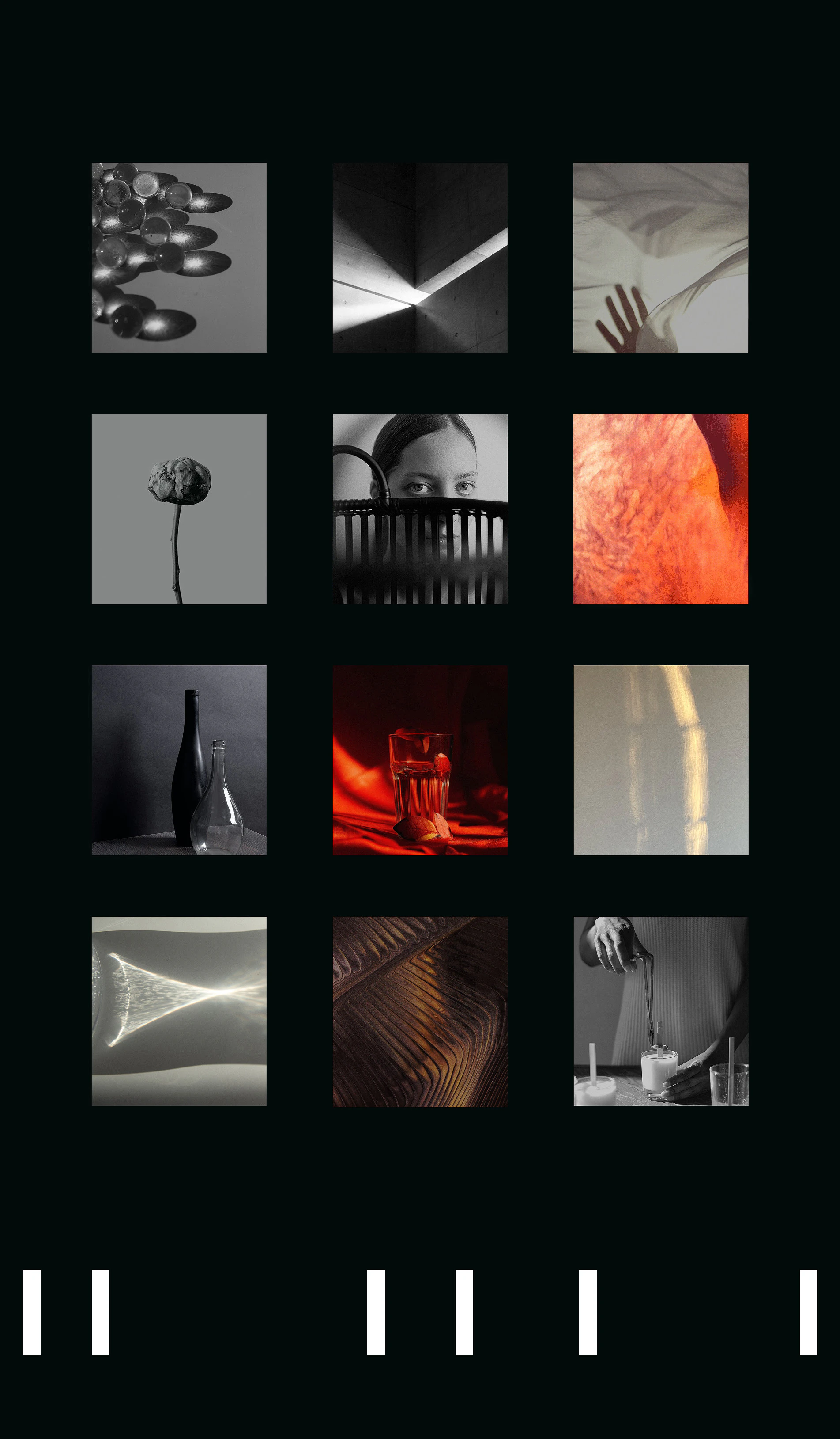

Overview
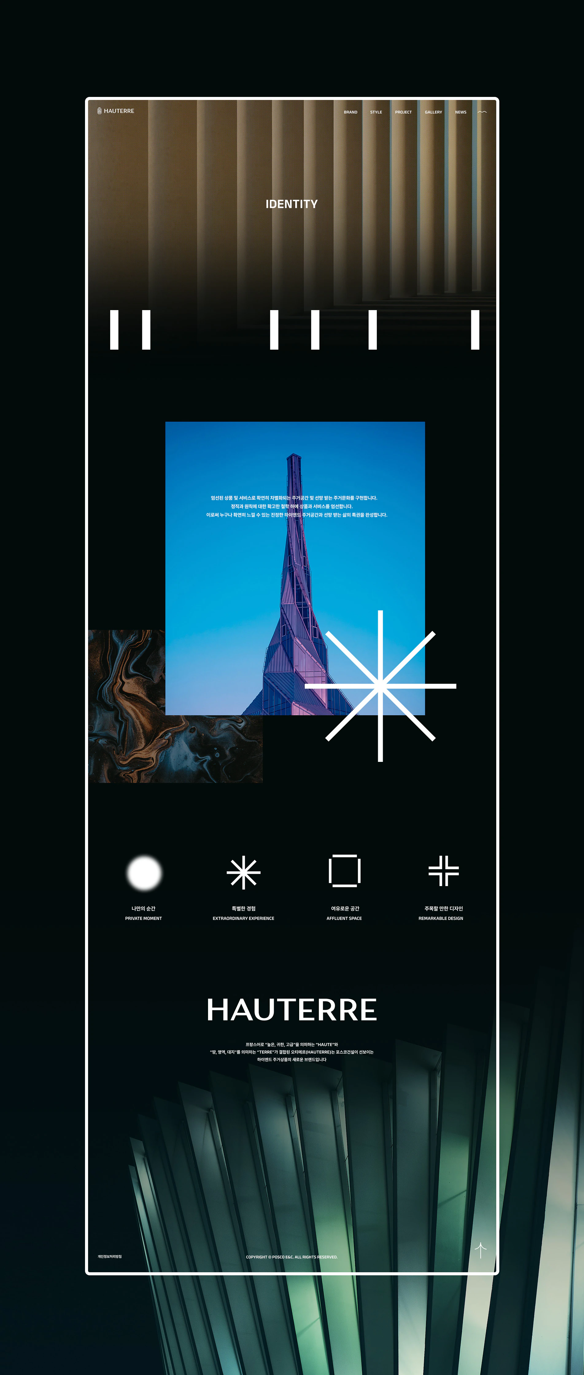
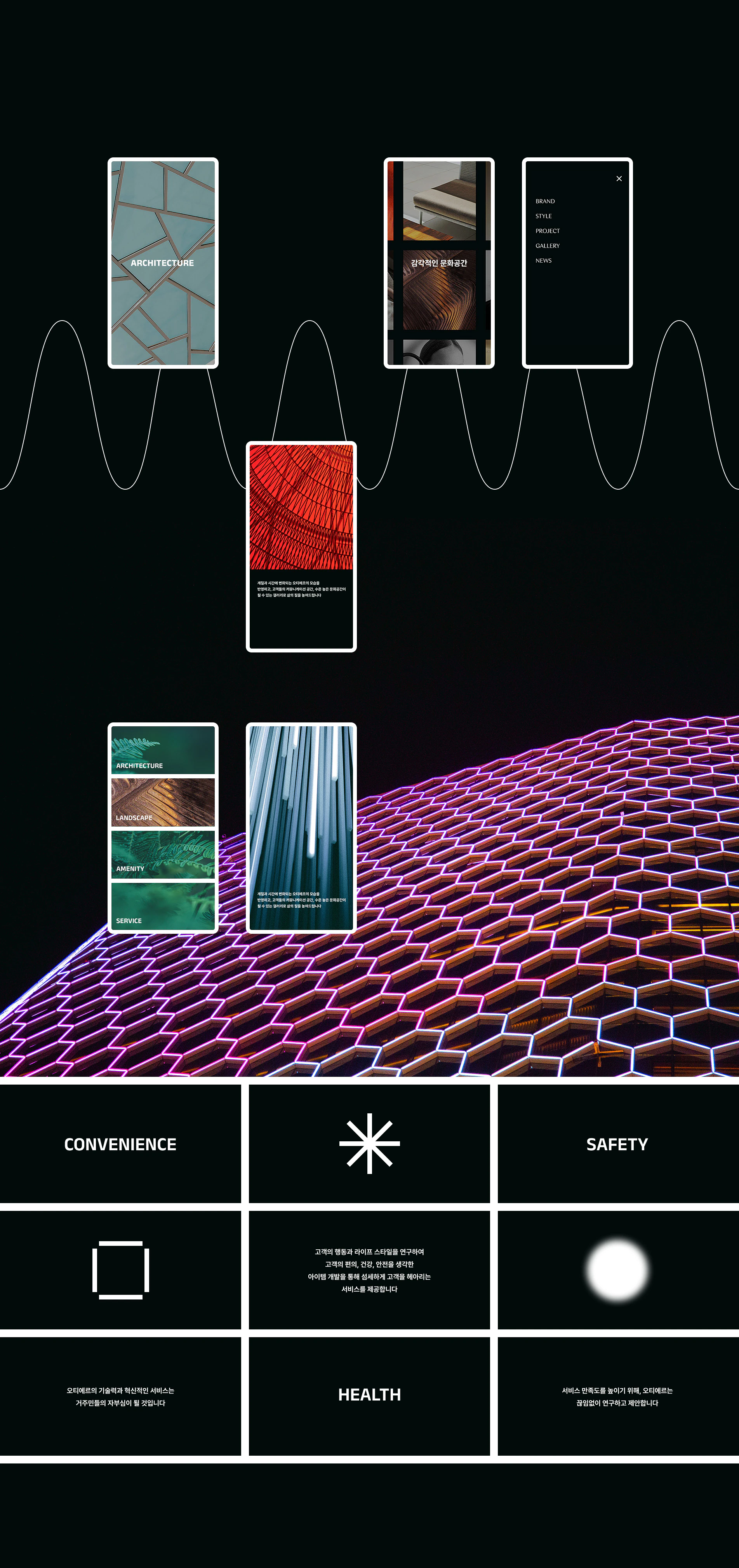
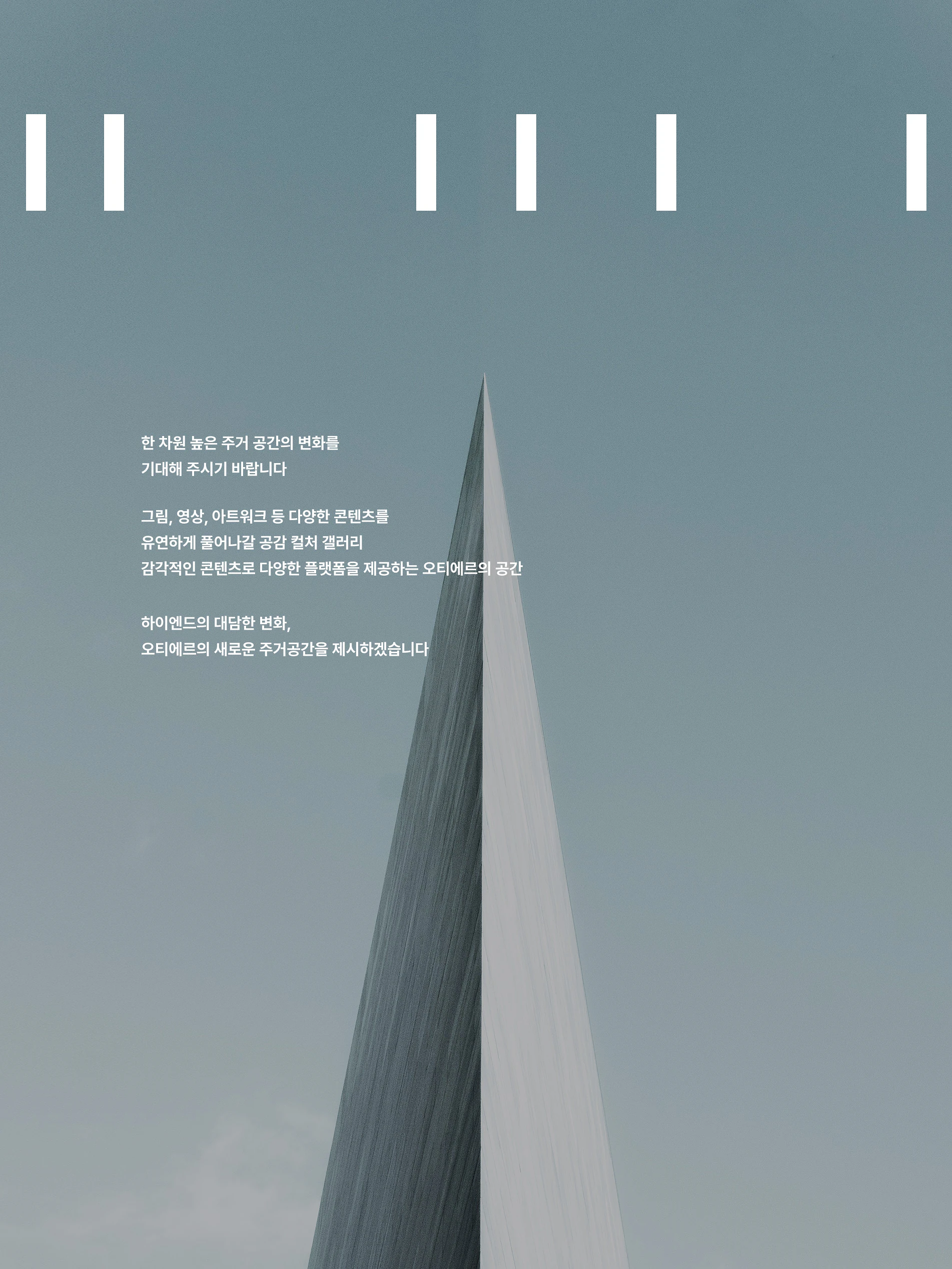
HAUTERRE, a French compound of 'HAUTE' and 'TERRE' meaning a special place where noble people live, is the high-end brand of POSCO E&C. To capture the identity of the newly launched brand, we set the design concept around the keyword 'Bold Exclusivity' and focused on copywriting that could convey HAUTERRE's message and values.
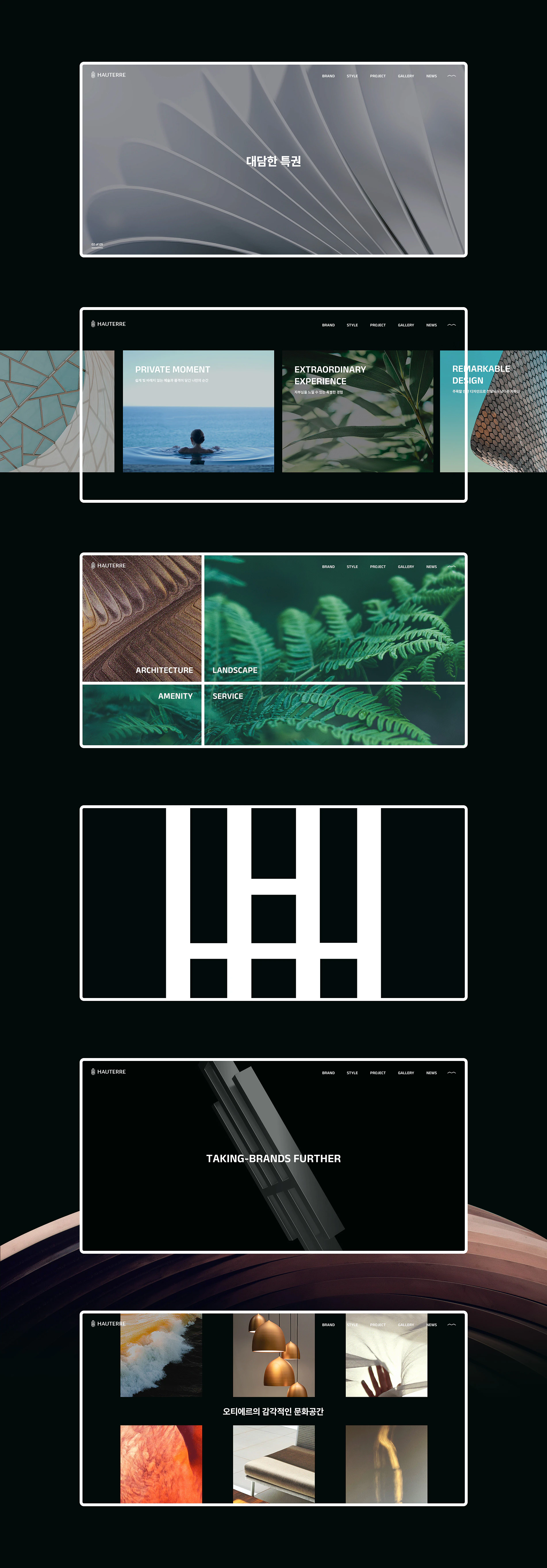
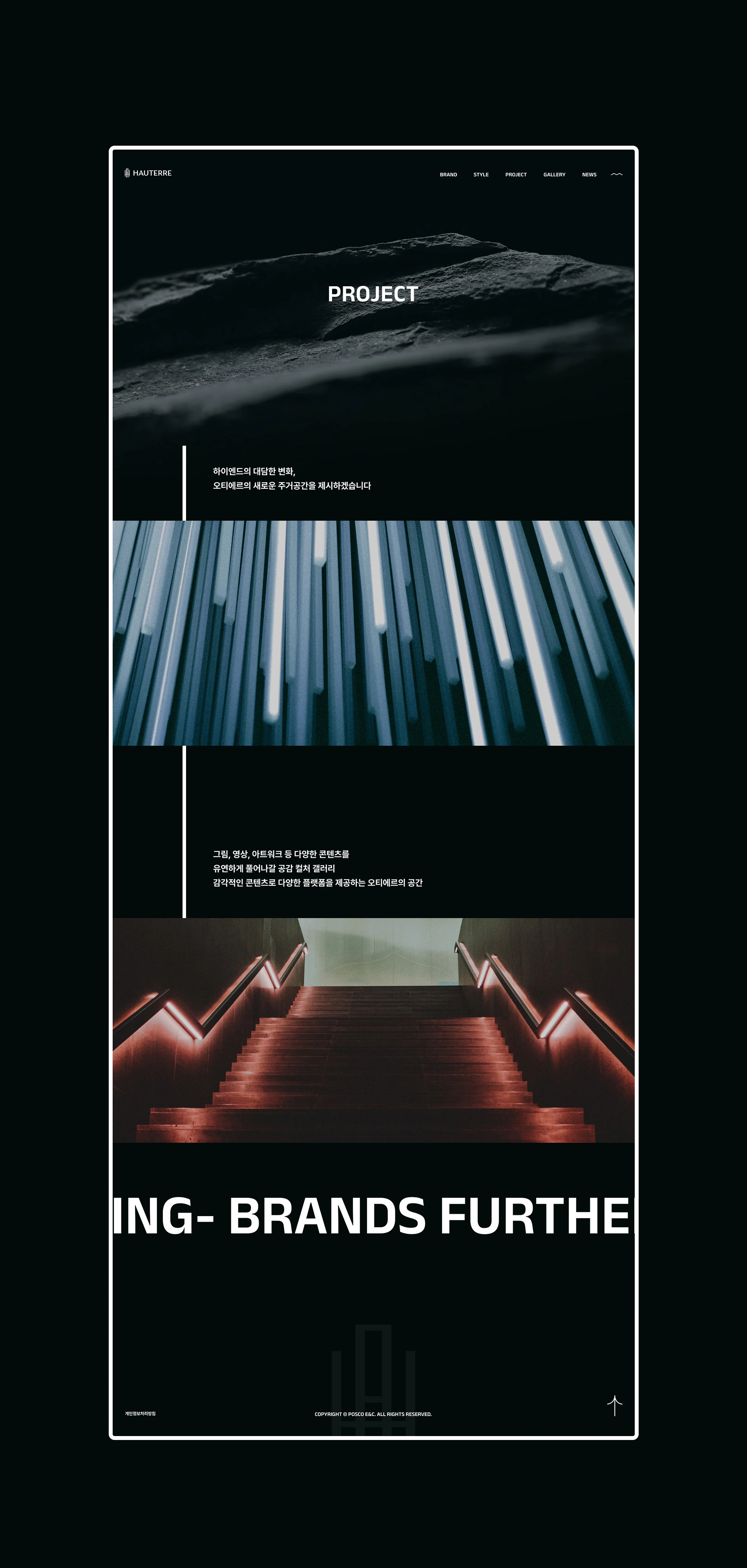
· An intro that delivers the brand's impact and builds anticipation · A main visual film that expresses space through straight lines of light, drawing the eye and conveying overwhelming grandeur · A background score that opens with the flutter and anticipation of a piano melody, with a cello adding stability and grandeur · A one-page structure that heightens focus on the brand and brings its message forward · An interactive composition that alternates dynamic and static sensations to create rhythm · A designed footer using the bold HAUTERRE logo, rendered dimensionally through 3D modeling
As the first channel to introduce HAUTERRE, we worked to make sure its high-end brand image came through clearly.
Team
- Giyeong Kim
- Dawoon Jeong
- Chaehee Kim
- Minseo Kim
- Minseok Kim
Awards
- &award 2022 · GRAND PRIX
Tags
Like this project?
Give it a like!
(8,546)